
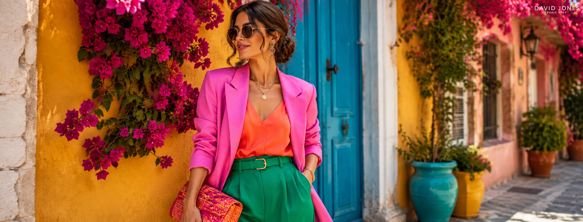
How to Mix and Match Colors in Your Outfit: A Complete Guide
Knowing which colors look good together can completely change the way you dress.
But you don’t need to memorize dozens of fashion rules or own a perfectly coordinated wardrobe to create outfits that look intentional.
The secret is understanding a few simple principles: color relationships, contrast, proportion, tone and repetition.
Once you understand how these work together, mixing colors becomes much easier.
You can create a soft monochromatic outfit, combine neighbouring shades for a harmonious look, or use contrasting colors when you want something more expressive.
And importantly, there isn’t just one “correct” way to combine colors. Fashion in 2026 is embracing stronger and more unexpected color combinations, from olive and tomato red to sky blue and chocolate brown.
So instead of asking:
“Which colors are allowed together?”
A better question is:
“How can I balance these colors so the outfit feels intentional?”
Here’s how
Understanding Color in Fashion
Before getting into outfit combinations, it helps to understand three characteristics of color:
Hue
Hue is essentially the color itself, such as red, blue, green or yellow.
Saturation
Saturation describes how intense or muted a color appears.
For example:
Bright red → highly saturated
Burgundy → more muted and deeper
This matters because two colors can technically be complementary but feel completely different depending on their saturation.
Value
Value refers to how light or dark a color is.
For example:
Pale blue → light value
Navy → dark value
When combining colors, changing their value or saturation can make a bold combination much easier to wear.
This is one reason fashion color matching is more nuanced than simply looking at a color wheel.
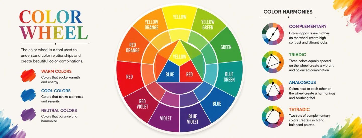
How to Use the Color Wheel for Your Outfits
The color wheel is a useful starting point when you aren’t sure which colors work together.
You don’t need to become an expert in color theory. Just understand four combinations.
Monochromatic Colors
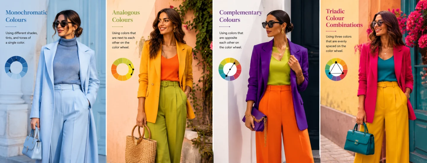
A monochromatic outfit uses different shades, tones or tints of essentially the same color.
For example:
Pale blue + denim blue + navy
or:
Cream + beige + camel
or:
Blush pink + rose + burgundy
This is one of the easiest ways to create a cohesive outfit because the colours naturally belong to the same colour family.
When to wear it:
Choose monochromatic dressing when you want your outfit to feel:
Polished
Minimal
Elegant
Cohesive
Easy to style
And monochromatic doesn’t mean wearing exactly the same shade from head to toe.
The variation is what gives the outfit depth.
Analogous Colors
Analogous colors sit next to each other on the color wheel.
Examples include:
Blue + teal + green
Yellow + orange
Red + coral + orange
Because these colours share visual similarities, they tend to create a softer and more harmonious combination.
A simple example:
Sage green trousers + teal top + cream shoes
The cream acts as a neutral element that gives the colours space.
Best for:
If you’re experimenting with colour for the first time, analogous combinations are a good place to start.
Complementary Colors
Complementary colors sit opposite each other on the color wheel.
Classic examples include:
Blue + orange
Purple + yellow
Red + green
These combinations create strong visual contrast.
But here’s where many people go wrong.
You don’t necessarily want to wear the brightest version of both colours at the same time.
Instead, experiment with variations:
Navy + rust
Burgundy + forest green
Lavender + soft yellow
Muted or deeper versions can make a high-contrast combination feel considerably more sophisticated.
Triadic Color Combinations
A triadic combination uses three colors spaced relatively evenly around the color wheel.
For example:
Red + yellow + blue
This can create a playful and energetic outfit.
But because three strong colors can quickly become overwhelming, it’s usually better to let one color dominate while the others appear in smaller amounts.
This is where proportion becomes more important than the color wheel itself.
The Most Useful Rule: Don’t Give Every Color Equal Attention
This is one of the biggest differences between an outfit that looks coordinated and one that looks chaotic.
You don’t necessarily need to use only two colors.
You need to decide which color is the main character.
A practical formula is:
Dominant color → Supporting color → Accent
For example:
60% navy + 30% white + 10% red
Or:
70% beige + 20% chocolate brown + 10% burgundy
The exact percentages aren’t a fashion law. Think of them as a visual guideline: one color establishes the foundation, another supports it, and a smaller accent creates interest. Current styling guides similarly recommend thinking in terms of a dominant base, secondary color and restrained accent rather than giving every color equal visual weight.
Start With a Neutral Base
If combining colors feels intimidating, don’t start with three bright colors.
Start with a neutral.
Useful neutrals include:
Black
White
Cream
Beige
Camel
Grey
Navy
Brown
For example:
Black trousers + white shirt + red handbag
Suddenly, red becomes an intentional accent instead of competing with several other colors.
Or:
Cream trousers + chocolate brown top + burgundy shoes
The neutral or muted base gives the stronger color somewhere to sit.
How to Add Color Without Making Your Outfit Look Busy
One of the easiest ways to introduce more color is through small areas rather than large ones.
Instead of wearing:
Red top + green trousers + purple shoes
try:
White shirt + dark denim + red shoes
Or:
Beige dress + green earrings + burgundy bag
The color doesn’t have to dominate the outfit to make an impact.
This is particularly useful if you’re naturally more comfortable wearing neutrals.
Use Accessories to Introduce Color
This is where accessories become particularly useful.
You can change the color story of an outfit without changing the entire outfit.
For example:
Black dress + red handbag
creates a completely different impression from:
Black dress + camel handbag
And:
Cream outfit + chocolate brown bag
creates a softer, warmer look.
Accessories can therefore act as color bridges between different parts of an outfit.
A handbag, scarf, shoes or jewellery can repeat an existing color or introduce a controlled accent.
Fashion coverage in 2026 has also highlighted the use of a colored handbag as a particularly simple way to introduce stronger color into an otherwise neutral wardrobe.
How to Match Your Bag With Your Outfit Colors
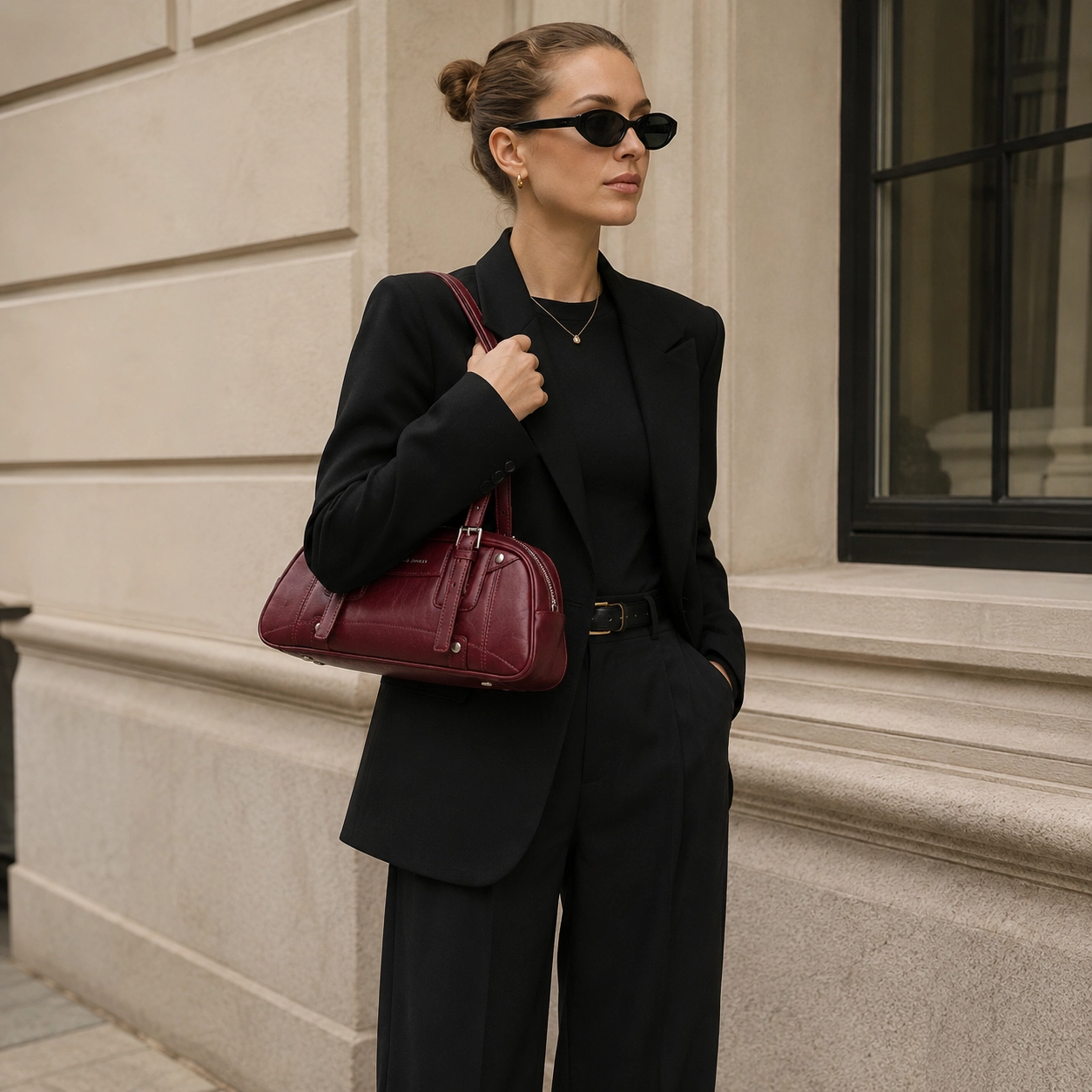
Your Bag does not have to match your outfit exactly.
In fact, exact matching can sometimes make an outfit feel overly coordinated.
Instead, think about three possibilities.
To learn more about how to choose the perfect bag color for your style and work, explore the article “The Best Bag Colors for Work.”
Repeat a Color
If you’re wearing burgundy shoes, a burgundy handbag can subtly repeat the color and create continuity.
You don’t have to match the shades perfectly.
Complement a Color
A neutral outfit gives you freedom to introduce contrast.
For example:
Cream outfit + deep green handbag
or:
Navy outfit + warm tan handbag
Balance a Strong Outfit
If your clothing already contains several colors, a neutral handbag can provide visual breathing room.
For example:
Printed dress + black handbag
or:
Colour-blocked outfit + beige handbag
This is a much more useful approach than thinking:
“My handbag must be the same colour as my shoes.”
The goal is colour harmony, not identical accessories.
8 Easy Color Combinations to Try
If you want something practical, start with combinations that are relatively easy to build into an existing wardrobe.
Navy + White + Tan
A classic combination that works particularly well for everyday and smart-casual outfits.
Beige + Chocolate Brown + Cream
Warm, understated and easy to build with neutral wardrobe pieces.
Black + White + Red
A simple base with one strong accent.
Olive + Burgundy
A deeper combination that feels rich without relying on bright colors.
Sky Blue + Chocolate Brown
A particularly current pairing that combines a lighter cool shade with a warm neutral. It has also appeared among the more notable color combinations in current 2026 fashion coverage.
Butter Yellow + Chocolate Brown
The brown helps ground the softer yellow and keeps the combination from feeling overly sweet.
Lavender + Soft Yellow
A lighter complementary-inspired combination that works particularly well when both shades are slightly muted.
Teal + Navy + Cream
An analogous/cool-toned combination that feels cohesive while still having enough contrast.
How to Mix Warm and Cool Colors
You don’t always have to keep every color in your outfit within the same temperature family.
Warm colors generally include shades such as:
Red
Orange
Yellow
Warm brown
Cool colors include:
Blue
Green
Purple
Mixing the two can create much more interesting outfits.
For example:
Sky blue + chocolate brown
works because the cool blue contrasts with the warmth of brown while remaining relatively easy on the eye.
Or:
Olive + burgundy
combines earthy warmth and depth rather than relying on obvious bright contrast.
The important thing is to pay attention to undertones and intensity, not just whether a color is technically warm or cool.
How to Mix Colors When Wearing Prints
Prints can make color coordination easier than you might expect.
The trick is to let the print provide your color palette.
For example, if your patterned blouse contains:
Blue + cream + brown
you can take one of those colors and repeat it elsewhere.
Try:
Printed blouse + cream trousers + brown handbag
or:
Printed blouse + blue trousers + neutral shoes
You don’t need to introduce another unrelated color.
The One-Color Repeat Technique
Choose one color from the print and repeat it in a smaller accessory.
This creates a subtle visual connection throughout the outfit.
How to Make Bold Color Combinations Look More Sophisticated
Bright colors aren’t automatically less elegant.
The difference often comes down to balance.
If you’re wearing a highly saturated color, consider keeping one or two other elements quieter.
For example:
Cobalt blue dress + nude shoes + simple accessories
rather than:
Cobalt blue + bright yellow + hot pink + patterned shoes
You can absolutely create a maximalist look, but it works better when the color relationships are intentional.
Current fashion has been moving toward stronger color and more expressive combinations, so there is no need to treat bold color as something that must always be toned down
Common Color-Matching Mistakes to Avoid
Matching Everything Exactly
Your shoes, bag, belt and clothing don’t need to be identical colors.
Coordination is more modern and flexible than exact matching.
Using Too Many Accent Colors
If every element is competing for attention, there is no visual hierarchy.
Choose a dominant color and let one or two accents support it.
Ignoring Saturation
Bright red and muted burgundy are both “red”, but they behave very differently in an outfit.
Forgetting Proportion
A color can work beautifully as a small accent but feel overwhelming when it covers half the outfit.
Following the Color Wheel Too Literally
The color wheel is a tool, not a rulebook.
Fabric, texture, lighting, silhouette and personal style all affect how a color combination actually looks.
How to Build an Outfit Around One Color
If you’re standing in front of your wardrobe and don’t know where to start, choose one item first.
It could be:
* A blazer
* A dress
* A pair of trousers
* A bag
* A pair of shoes
Then build around it.
For example, start with a burgundy handbag.
You could build:
Burgundy + cream + chocolate brown
Or:
Burgundy + navy + white
Or:
Burgundy + olive + beige
The accessory becomes the starting point rather than something you try to match at the very end.
This can be particularly useful when you want to add more color to a wardrobe dominated by black, white or beige.
A Simple Formula for Mixing Colors Every Morning
When you don’t have time to think about color theory, use this five-step method.
Choose Your Base
Pick a neutral or dominant color.
Add One Supporting Color
Choose a color that sits comfortably beside or complements your base.
Decide on the Contrast
Do you want the outfit to feel:
Soft → similar tones
Polished → tonal colours
Dynamic → contrasting colors
Add One Accent
Use a smaller accessory, shoe, scarf or bag for a pop of color.
Remove One Thing
Before leaving the house, look at the outfit as a whole.
If something feels unnecessary, remove it.
Good color styling is often as much about editing as adding.
How to Choose Colors That Suit Your Personal Style
There is no single color palette that every woman should follow.
Instead, notice which colors consistently make you feel good.
You can also experiment with how different colors interact with your natural coloring. Personal color analysis often groups people into broad seasonal palettes, such as spring, summer, autumn and winter, based on characteristics including undertone and contrast.
But don’t treat seasonal color analysis as a strict rule.
If you love a color that supposedly isn’t “your season”, styling it differently changing its saturation, placing it farther from the face, or pairing it with a flattering neutral can make it work.
Personal style should guide the rules, not the other way around.
The Easiest Way to Experiment With Color
If your wardrobe is mostly neutral, don’t suddenly buy five colorful pieces.
Start with one accent color.
For example:
Black wardrobe + burgundy
Then experiment with:
* Burgundy shoes
* Burgundy handbag
* Burgundy scarf
* Burgundy belt
Once you’re comfortable, introduce another color.
This allows you to understand what you actually enjoy wearing instead of buying colorful pieces that eventually stay in the back of your wardrobe.
Final Thoughts
Mixing and matching colors doesn’t have to mean following complicated fashion rules.
Start with the basics:
Choose a dominant color.
Add a supporting shade.
Use contrast intentionally.
Pay attention to saturation and proportion.
Use accessories to introduce or repeat color.
And most importantly, experiment.
The best color combinations aren’t always the ones that look perfect on a color wheel. They’re the ones that make the entire outfit feel balanced, intentional and like you.
Start with a neutral base, add one supporting colour and finish with a small accent. Monochromatic and analogous combinations are particularly easy starting points.
There is no fixed maximum. However, choosing one dominant color, one supporting color and one smaller accent can make an outfit easier to balance.
No. Your handbag and shoes don’t need to be the same color. They can instead complement each other through similar tones, contrasting colors or shared undertones.
The colour wheel helps identify relationships between colours, including monochromatic, analogous, complementary and triadic combinations. It is a styling guide rather than a strict set of rules.